


How to create a Toggle Switch For Dark mode Feature with HTML, CSS and JS
A beginner's guide in creating toggle switch and implementing dark mode for web apps.


Table of contents
Introduction
A toggle switch allows users to switch between two states with a single action, such as clicking or tapping. For instance, when switching from the generator to the NEPA light, some of us are so good with such a switch that people won't notice the change at all, I know you want to go and test your idan power 🤣. Please don't go, let me teach you 👇
if you want to change the switch without being noticed, place your right hand under the switch, fold it a bit and move it very fast. Don't hold it. You are welcome👍.
This switch is also implemented in almost every application, remember there was a time when we were all used to light mode on our apps that is there is no feature that allowed you to switch to dark mode or vice versa but right now such a feature is being implemented.
Take Hashnode for instance 👇

This toggle allows you to switch to dark mode and vice versa.
In this article, you will learn how to create this toggle switch and implement light/dark modes.
Prerequisites
You must have a text editor and browser
Know HTML, CSS and Js
Must already have a folder including HTML file, CSS file and Js file in the folder already
A bottle of water(stay hydrated 😜)
HTML
we will begin with the HTML markup, remember HTML is the skeleton of any web application and we will be using the button tag only, you can embed the button tag in a div if you want.
 <!DOCTYPE html>
<html lang="en">
<head>
    <meta charset="UTF-8">
    <meta name="viewport" content="width=device-width, initial-scale=1.0">
    <link rel="stylesheet" href="style.css">
    <title>ToggleButton</title>
</head>
<body>
 <button id="toggleButton"></button>
<script src="script.js"></script>
</body>
</html>
output👇
That's all the HTML we need for this switch.
CSS
- Button
we'll start by styling the button.
button {
    width: 50px;
    height: 25px;
    margin: 20px;
    border: none;
    border-radius: 25px;
    position: relative;
    background-color: black;
    cursor: pointer;
  }
the output 👇
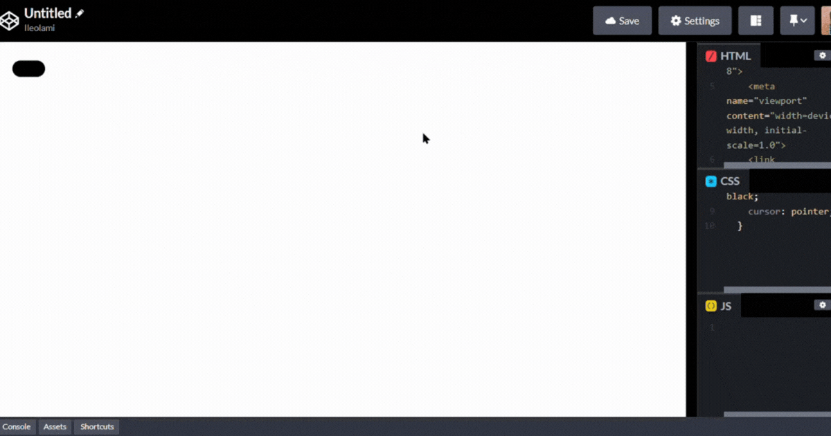
position: relative: Sets the positioning context for the button to be relative. This is often used in conjunction with absolute or relative positioning of child elements.
- The Ball
For the ball, we will be using the CSS Pseudo-elements ::before . pseudo-elements and pseudo-classes are used to style elements based on their state or position in the document. Pseudo-elements are used to style a specific part of an element, e.g ::before, ::after while pseudo-classes are used to style elements based on their state or relationship with other elements e.g :hover, :active, :focus .
The ::before will used to insert content before the button element.
button::before {
    content: '';
    position: absolute;
    top: 2.5px;
    left: 0;
    width:20px;
    height:20px;
    border: none;
    border-radius: 50%;
    background-color: white;
    transition: 0.6s ease-in-out;
  }
We set the position of the button element to relative because when a child element's position is absolute, it moves away from its original position causing it to pull off its natural position and floats off a parent element with a relative position to attach itself to.
content: '' : Specifies the content of the pseudo-element. In this case, it's an empty string, as the pseudo-element is used for styling only.
transition: 0.6s ease-in-out : Adds a smooth transition effect over 0.6 seconds with an ease-in-out timing function. This is applied to changes in properties left.
top: 2.5px: Sets the distance from the top of the button for the pseudo-element.
left: 0: Sets the distance from the left of the button for the pseudo-element.
output👇
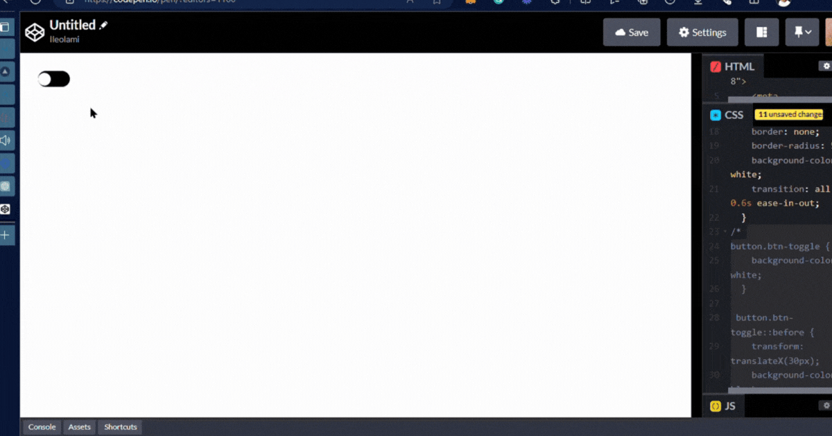
- The Class displays when there is a click
This CSS code will be used for stylingbodyandbuttonelements with the classbtn-toggleand used in combination with JavaScript to create toggle effects.
button.btn-toggle {
    background-color: white;
  }

 button.btn-toggle::before {
    transform: translateX(30px);
    background-color: black;
  }

  body.btn-toggle {
    background: black;
  }
The purpose of not initially setting the .btn-toggle class in HTML is to control its visibility through JavaScript. This setup allows dynamic changes in appearance when you click on the button, to create switch behaviour on your web page.
Take a look at what is happening in the console 👇

You can notice the btn-toggle display and the change in the background when we click on the switch, this trigger will handled by the javascript as we all know javascript is all about functionality.
I hope you are following 🤔
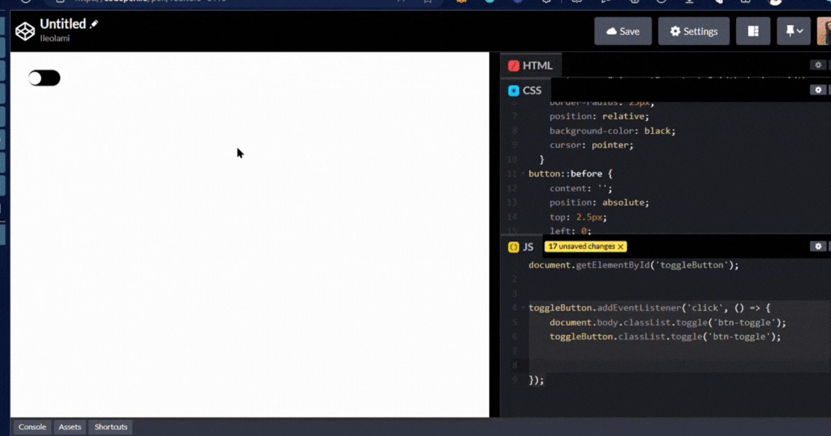
JavaScript
- Select the HTML element
const toggleButton = document.getElementById('toggleButton');
This syntax is used to select the button element with id toggleButton with the getElementById method and its been stored to a variable called const toggleButton.
- The Event
toggleButton.addEventListener('click', () => {
    document.body.classList.toggle('btn-toggle');
    toggleButton.classList.toggle('btn-toggle');

// Save the current state to localStorage
localStorage.setItem('toggleState', document.body.classList.contains('btn-toggle') ? 'true' : 'false');
});
This adds a click event listener to an HTML element with the id toggleButton. When this element is clicked, it triggers the following actions:
document.body.classList.toggle('btn-toggle'): It toggles the presence of the CSS classbtn-toggleon the<body>element. If the class is not present, it adds it; if it's present, it removes it.toggleButton.classList.toggle('btn-toggle'): It does the same as the previous line but for thebtn-toggleclass on thetoggleButtonelement. It toggles the presence of the class on the button element.localStorage.setItem('toggleState', document.body.classList.contains('btn-toggle') ? 'true' : 'false');it added to updates to the local storage with the current state of thebtn-toggleclass by settingtrueif it's present orfalseif it's not.
output👇
Page Load Event
  // Event listener for window load
  window.addEventListener('load', () => {
      // Retrieve the saved state from localStorage (true or false)
      const savedState = localStorage.getItem('toggleState') === 'true';
      // Check the current state of "btn-toggle" class on the body element
      const toggleState = document.body.classList.contains('btn-toggle');

      // If there's a mismatch between saved and current states
      if (savedState !== toggleState) {
          // Toggle the "btn-toggle" class on the body element
          document.body.classList.toggle('btn-toggle');
          // Toggle the "btn-toggle" class on the toggleButton element
          toggleButton.classList.toggle('btn-toggle');
      }
  });
window.addEventListener('load', () =>{}): sets up a load event listener on the window, which triggers when the page finishes loading.const savedState = localStorage.getItem('toggleState') === 'true';: It retrieves the previously saved state from local storagetoggleStateand compares the saved state with the current state (presence ofbtn-toggleclass on the<body>).if (savedState !== toggleState) { document.body.classList.toggle('btn-toggle'); toggleButton.classList.toggle('btn-toggle'); }: if there's a mismatch, it toggles thebtn-toggleclass on both the<body>element and thetoggleButton. This ensures that the UI reflects the correct state saved in local storage.
Final output 👇

I hope you find this helpful, If you do, let me in the comment section
like💗, comment ✍ and Follow 🏃♀️or
Bye For Now ❤❤